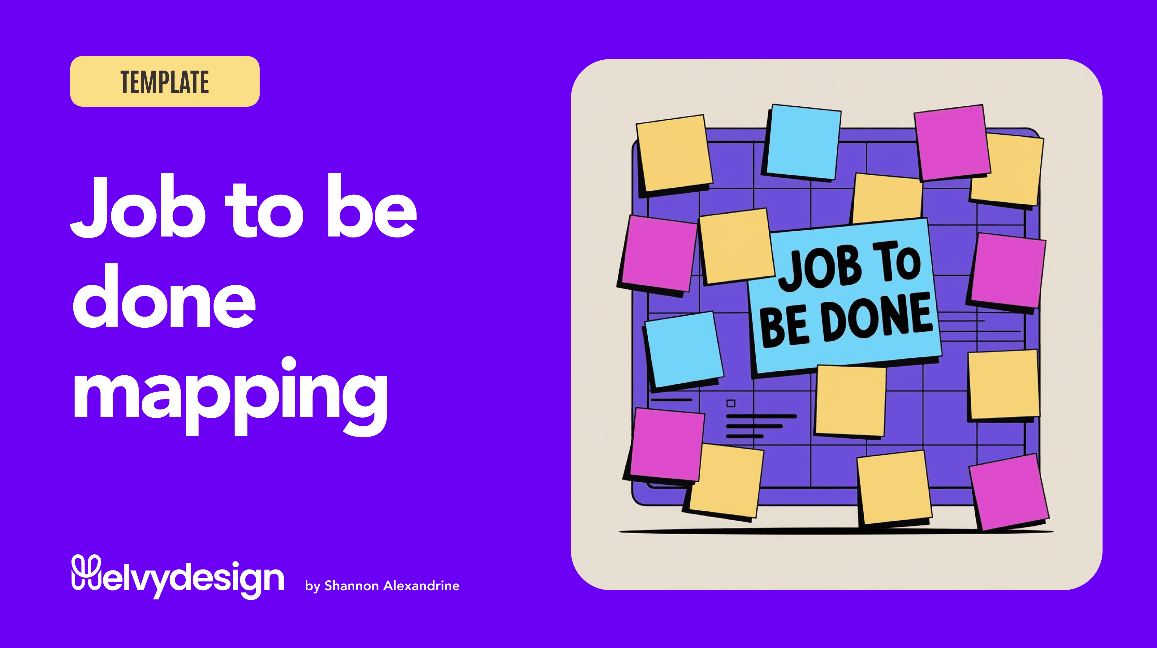
From UI Kit to Design System
Building foundations before scalability lessons learned from Bestmile
Insights
Feb 18, 2021

UI Kit vs Design System clarification
Before sharing my experience, let’s clarify a common confusion: a UI Kit is not a Design System.
A UI Kit is a collection of reusable visual components, buttons, inputs, icons, colors, typography styles.
It helps designers ship consistent interfaces faster.
It’s a production tool.
A Design System, on the other hand, is product infrastructure.
It includes:
components
UX principles
documented usage rules
design tokens
code implementation
governance
structured alignment between design and engineering
👉 A UI Kit helps you design faster.
👉 A Design System helps a product scale sustainably.
And that transition, I lived it from the inside.
Context
In early 2018, Bestmile started a major platform rebuild.
A new frontend team formed with Manuel Hitz and Jean-Baptiste Cochery, led on the product/engineering side by David Geretti.
A new Operator Dashboard replaced the legacy Fleet Management Tool.
When I joined almost a year later, this was still before the acquisition by ZF.
The product was being rebuilt.
Scalability was on the horizon.
But there was no unified UX vision yet, and no structured Design System.
I joined in January 2019 as the first and solo UX/UI designer.
Everything still had to be defined.

I intentionally started with a UI Kit
Before talking about Design Systems, let’s be honest:
I started with a UI Kit.
Why?
Because we needed to ship fast.
The product was moving quickly.
The frontend team was rebuilding the platform.
We needed immediate visual consistency.
So in Sketch, I structured:
a color palette
typography
base components
recurring patterns
This UI Kit allowed us to:
align screens
speed up delivery
reduce visual inconsistencies
But very quickly, its limitations appeared.
The real problem wasn’t visual
The interfaces looked consistent.
But the system was fragile.
The same component could:
be implemented differently
evolve without global updates
diverge between web and mobile
The debt wasn’t graphical.
It was systemic.
And in a platform used daily by operational teams, consistency is a performance lever.

From UI Kit to Design System
Starting from the Sketch UI Kit, I progressively built steps by steps a Design System.
UX first
Before structuring any Design System, I stepped back and looked at the product as it actually existed.
I began by reviewing our main operational screens — the ones used daily by teams — to understand:
which components appeared most often
which patterns were critical to user workflows
what truly needed to be standardized
and what could remain more flexible
Rather than designing an “ideal” component library, I started from real usage.
Concretely, I identified the essential building blocks:
buttons (with a clear hierarchy of actions)
search fields
data tables (at the core of the product)
maps (which I personally designed and integrated around Mapbox)
timelines to visualize traveler and driver journeys
empty, loading, and error states
navigation patterns
These components weren’t chosen because they’re “standard”.
They were chosen because they represented the actual work of our users.
User flows shaped the system.
Real usage defined the components.
Not the other way around.
Only after this UX reading of the product did I start structuring:
foundations
components
then patterns.
Documentation with InVision DSM
To move beyond Sketch, I documented the system in InVision Design System Manager (DSM).
At the time, Sketch didn’t yet offer collaborative prototyping or centralized commenting.
We were exporting Sketch screens into InVision to:
create interactive prototypes
collect feedback
share designs with stakeholders
Naturally, we also chose InVision DSM to:
centralize guidelines
document components
structure usage
connect design and implementation
This marked a real shift:
from design living locally in Sketch
→ to design as shared, documented infrastructure.
With today’s perspective, if I had to choose again, I’d probably go with Zeroheight.
InVision has since declined, and Zeroheight feels more robust and future-proof for Design System documentation.
But at that moment, DSM fit our stack and our maturity.


Frontend is not a relay, it’s a partner
Even as a solo designer, the Design System was never “my” project.
It was co-built with frontend.
Together we worked on:
UX intent ↔ component APIs
edge cases
web/mobile consistency
behavioral documentation
continuous Sketch ↔ code iteration
Design fed the code.
Code fed the design.
That collaboration made the system real and usable.
Before ZF: laying the foundations
All this happened before the ZF acquisition.
At that stage, the Design System wasn’t a strategic program.
It was a pragmatic necessity.
But those foundations later enabled:
scalability
smoother onboarding
stronger product coherence
organizational maturity
A Design System becomes strategic in hindsight.
At first, it simply answers a real need.
Does every company or product need a Design System?
Short answer: no.
A Design System makes sense when:
Multiple teams collaborate
The product is multi-platform
UX debt slows delivery
consistency becomes critical
It becomes counterproductive when:
The team is very small
The product is still exploratory
There’s no capacity to maintain it
It’s created because “everyone has one.”
In many cases, a well-structured UI Kit is enough.
What this experience taught me
Starting with a UI Kit is pragmatic
Evolving into a Design System is strategic
UX comes before components
documentation is design
Frontend collaboration is essential
Consistency is a user feature
A Design System is not a deliverable.
It’s living infrastructure.
And tomorrow, what role will AI play in Design Systems?
One last, more open question.
As AI already reshapes how we design, prototype, and code…
What will Design Systems become?
dynamically generated components?
adaptive tokens based on user context?
data-driven guidelines?
automatically personalized experiences?
Maybe Design Systems will evolve into less rigid, more intelligent ecosystems — continuously adapting to usage.
One thing feels certain:
Design Systems will move from static libraries to intelligent ecosystems.
And in that future, the designer’s role becomes even more strategic.
Because while AI accelerates execution, it doesn’t replace:
product sense
user empathy
systemic thinking
or human judgment.
I’d love to exchange on these topics — Design Systems, UX, design + engineering collaboration, and AI’s impact on our craft.
Looking forward to the conversation. 🤍

More to Discover

From UI Kit to Design System
Building foundations before scalability lessons learned from Bestmile
Insights
Feb 18, 2021
UI Kit vs Design System clarification
Before sharing my experience, let’s clarify a common confusion: a UI Kit is not a Design System.
A UI Kit is a collection of reusable visual components, buttons, inputs, icons, colors, typography styles.
It helps designers ship consistent interfaces faster.
It’s a production tool.
A Design System, on the other hand, is product infrastructure.
It includes:
components
UX principles
documented usage rules
design tokens
code implementation
governance
structured alignment between design and engineering
👉 A UI Kit helps you design faster.
👉 A Design System helps a product scale sustainably.
And that transition, I lived it from the inside.
Context
In early 2018, Bestmile started a major platform rebuild.
A new frontend team formed with Manuel Hitz and Jean-Baptiste Cochery, led on the product/engineering side by David Geretti.
A new Operator Dashboard replaced the legacy Fleet Management Tool.
When I joined almost a year later, this was still before the acquisition by ZF.
The product was being rebuilt.
Scalability was on the horizon.
But there was no unified UX vision yet, and no structured Design System.
I joined in January 2019 as the first and solo UX/UI designer.
Everything still had to be defined.
I intentionally started with a UI Kit
Before talking about Design Systems, let’s be honest:
I started with a UI Kit.
Why?
Because we needed to ship fast.
The product was moving quickly.
The frontend team was rebuilding the platform.
We needed immediate visual consistency.
So in Sketch, I structured:
a color palette
typography
base components
recurring patterns
This UI Kit allowed us to:
align screens
speed up delivery
reduce visual inconsistencies
But very quickly, its limitations appeared.
The real problem wasn’t visual
The interfaces looked consistent.
But the system was fragile.
The same component could:
be implemented differently
evolve without global updates
diverge between web and mobile
The debt wasn’t graphical.
It was systemic.
And in a platform used daily by operational teams, consistency is a performance lever.
From UI Kit to Design System
Starting from the Sketch UI Kit, I progressively built steps by steps a Design System.
UX first
Before structuring any Design System, I stepped back and looked at the product as it actually existed.
I began by reviewing our main operational screens — the ones used daily by teams — to understand:
which components appeared most often
which patterns were critical to user workflows
what truly needed to be standardized
and what could remain more flexible
Rather than designing an “ideal” component library, I started from real usage.
Concretely, I identified the essential building blocks:
buttons (with a clear hierarchy of actions)
search fields
data tables (at the core of the product)
maps (which I personally designed and integrated around Mapbox)
timelines to visualize traveler and driver journeys
empty, loading, and error states
navigation patterns
These components weren’t chosen because they’re “standard”.
They were chosen because they represented the actual work of our users.
User flows shaped the system.
Real usage defined the components.
Not the other way around.
Only after this UX reading of the product did I start structuring:
foundations
components
then patterns.
Documentation with InVision DSM
To move beyond Sketch, I documented the system in InVision Design System Manager (DSM).
At the time, Sketch didn’t yet offer collaborative prototyping or centralized commenting.
We were exporting Sketch screens into InVision to:
create interactive prototypes
collect feedback
share designs with stakeholders
Naturally, we also chose InVision DSM to:
centralize guidelines
document components
structure usage
connect design and implementation
This marked a real shift:
from design living locally in Sketch
→ to design as shared, documented infrastructure.
With today’s perspective, if I had to choose again, I’d probably go with Zeroheight.
InVision has since declined, and Zeroheight feels more robust and future-proof for Design System documentation.
But at that moment, DSM fit our stack and our maturity.
Frontend is not a relay, it’s a partner
Even as a solo designer, the Design System was never “my” project.
It was co-built with frontend.
Together we worked on:
UX intent ↔ component APIs
edge cases
web/mobile consistency
behavioral documentation
continuous Sketch ↔ code iteration
Design fed the code.
Code fed the design.
That collaboration made the system real and usable.
Before ZF: laying the foundations
All this happened before the ZF acquisition.
At that stage, the Design System wasn’t a strategic program.
It was a pragmatic necessity.
But those foundations later enabled:
scalability
smoother onboarding
stronger product coherence
organizational maturity
A Design System becomes strategic in hindsight.
At first, it simply answers a real need.
Does every company or product need a Design System?
Short answer: no.
A Design System makes sense when:
Multiple teams collaborate
The product is multi-platform
UX debt slows delivery
consistency becomes critical
It becomes counterproductive when:
The team is very small
The product is still exploratory
There’s no capacity to maintain it
It’s created because “everyone has one.”
In many cases, a well-structured UI Kit is enough.
What this experience taught me
Starting with a UI Kit is pragmatic
Evolving into a Design System is strategic
UX comes before components
documentation is design
Frontend collaboration is essential
Consistency is a user feature
A Design System is not a deliverable.
It’s living infrastructure.
And tomorrow, what role will AI play in Design Systems?
One last, more open question.
As AI already reshapes how we design, prototype, and code…
What will Design Systems become?
dynamically generated components?
adaptive tokens based on user context?
data-driven guidelines?
automatically personalized experiences?
Maybe Design Systems will evolve into less rigid, more intelligent ecosystems — continuously adapting to usage.
One thing feels certain:
Design Systems will move from static libraries to intelligent ecosystems.
And in that future, the designer’s role becomes even more strategic.
Because while AI accelerates execution, it doesn’t replace:
product sense
user empathy
systemic thinking
or human judgment.
I’d love to exchange on these topics — Design Systems, UX, design + engineering collaboration, and AI’s impact on our craft.
Looking forward to the conversation. 🤍
More to Discover
From UI Kit to Design System
Building foundations before scalability lessons learned from Bestmile
Insights
Feb 18, 2021
UI Kit vs Design System clarification
Before sharing my experience, let’s clarify a common confusion: a UI Kit is not a Design System.
A UI Kit is a collection of reusable visual components, buttons, inputs, icons, colors, typography styles.
It helps designers ship consistent interfaces faster.
It’s a production tool.
A Design System, on the other hand, is product infrastructure.
It includes:
components
UX principles
documented usage rules
design tokens
code implementation
governance
structured alignment between design and engineering
👉 A UI Kit helps you design faster.
👉 A Design System helps a product scale sustainably.
And that transition, I lived it from the inside.
Context
In early 2018, Bestmile started a major platform rebuild.
A new frontend team formed with Manuel Hitz and Jean-Baptiste Cochery, led on the product/engineering side by David Geretti.
A new Operator Dashboard replaced the legacy Fleet Management Tool.
When I joined almost a year later, this was still before the acquisition by ZF.
The product was being rebuilt.
Scalability was on the horizon.
But there was no unified UX vision yet, and no structured Design System.
I joined in January 2019 as the first and solo UX/UI designer.
Everything still had to be defined.
I intentionally started with a UI Kit
Before talking about Design Systems, let’s be honest:
I started with a UI Kit.
Why?
Because we needed to ship fast.
The product was moving quickly.
The frontend team was rebuilding the platform.
We needed immediate visual consistency.
So in Sketch, I structured:
a color palette
typography
base components
recurring patterns
This UI Kit allowed us to:
align screens
speed up delivery
reduce visual inconsistencies
But very quickly, its limitations appeared.
The real problem wasn’t visual
The interfaces looked consistent.
But the system was fragile.
The same component could:
be implemented differently
evolve without global updates
diverge between web and mobile
The debt wasn’t graphical.
It was systemic.
And in a platform used daily by operational teams, consistency is a performance lever.
From UI Kit to Design System
Starting from the Sketch UI Kit, I progressively built steps by steps a Design System.
UX first
Before structuring any Design System, I stepped back and looked at the product as it actually existed.
I began by reviewing our main operational screens — the ones used daily by teams — to understand:
which components appeared most often
which patterns were critical to user workflows
what truly needed to be standardized
and what could remain more flexible
Rather than designing an “ideal” component library, I started from real usage.
Concretely, I identified the essential building blocks:
buttons (with a clear hierarchy of actions)
search fields
data tables (at the core of the product)
maps (which I personally designed and integrated around Mapbox)
timelines to visualize traveler and driver journeys
empty, loading, and error states
navigation patterns
These components weren’t chosen because they’re “standard”.
They were chosen because they represented the actual work of our users.
User flows shaped the system.
Real usage defined the components.
Not the other way around.
Only after this UX reading of the product did I start structuring:
foundations
components
then patterns.
Documentation with InVision DSM
To move beyond Sketch, I documented the system in InVision Design System Manager (DSM).
At the time, Sketch didn’t yet offer collaborative prototyping or centralized commenting.
We were exporting Sketch screens into InVision to:
create interactive prototypes
collect feedback
share designs with stakeholders
Naturally, we also chose InVision DSM to:
centralize guidelines
document components
structure usage
connect design and implementation
This marked a real shift:
from design living locally in Sketch
→ to design as shared, documented infrastructure.
With today’s perspective, if I had to choose again, I’d probably go with Zeroheight.
InVision has since declined, and Zeroheight feels more robust and future-proof for Design System documentation.
But at that moment, DSM fit our stack and our maturity.
Frontend is not a relay, it’s a partner
Even as a solo designer, the Design System was never “my” project.
It was co-built with frontend.
Together we worked on:
UX intent ↔ component APIs
edge cases
web/mobile consistency
behavioral documentation
continuous Sketch ↔ code iteration
Design fed the code.
Code fed the design.
That collaboration made the system real and usable.
Before ZF: laying the foundations
All this happened before the ZF acquisition.
At that stage, the Design System wasn’t a strategic program.
It was a pragmatic necessity.
But those foundations later enabled:
scalability
smoother onboarding
stronger product coherence
organizational maturity
A Design System becomes strategic in hindsight.
At first, it simply answers a real need.
Does every company or product need a Design System?
Short answer: no.
A Design System makes sense when:
Multiple teams collaborate
The product is multi-platform
UX debt slows delivery
consistency becomes critical
It becomes counterproductive when:
The team is very small
The product is still exploratory
There’s no capacity to maintain it
It’s created because “everyone has one.”
In many cases, a well-structured UI Kit is enough.
What this experience taught me
Starting with a UI Kit is pragmatic
Evolving into a Design System is strategic
UX comes before components
documentation is design
Frontend collaboration is essential
Consistency is a user feature
A Design System is not a deliverable.
It’s living infrastructure.
And tomorrow, what role will AI play in Design Systems?
One last, more open question.
As AI already reshapes how we design, prototype, and code…
What will Design Systems become?
dynamically generated components?
adaptive tokens based on user context?
data-driven guidelines?
automatically personalized experiences?
Maybe Design Systems will evolve into less rigid, more intelligent ecosystems — continuously adapting to usage.
One thing feels certain:
Design Systems will move from static libraries to intelligent ecosystems.
And in that future, the designer’s role becomes even more strategic.
Because while AI accelerates execution, it doesn’t replace:
product sense
user empathy
systemic thinking
or human judgment.
I’d love to exchange on these topics — Design Systems, UX, design + engineering collaboration, and AI’s impact on our craft.
Looking forward to the conversation. 🤍